Role: UX/UI, Visual Designer
I was the sole UX/UI and visual designer on the team alongside 2 developers, 1 marketing manager,
1 project leader and the founder.
Timeline: 2 months (Dec 2022 - Jan 2023)
We focused on retention, ideation and production.
Tools:
- Adobe XD, Illustrator
- Zeplin
- 3D software Blender
- Google analytics
- Looker Studio
- Zeplin
- 3D software Blender
- Google analytics
- Looker Studio
Overview
It can be difficult for new users to stay motivated when using a product if they are unsure of its benefits and do not receive instant feedback.
To address this issue, we focused on the following solutions:
- simplifying the user journey
- designing a reward system
- improving the visual guides
- designing a reward system
- improving the visual guides
Understanding the problem
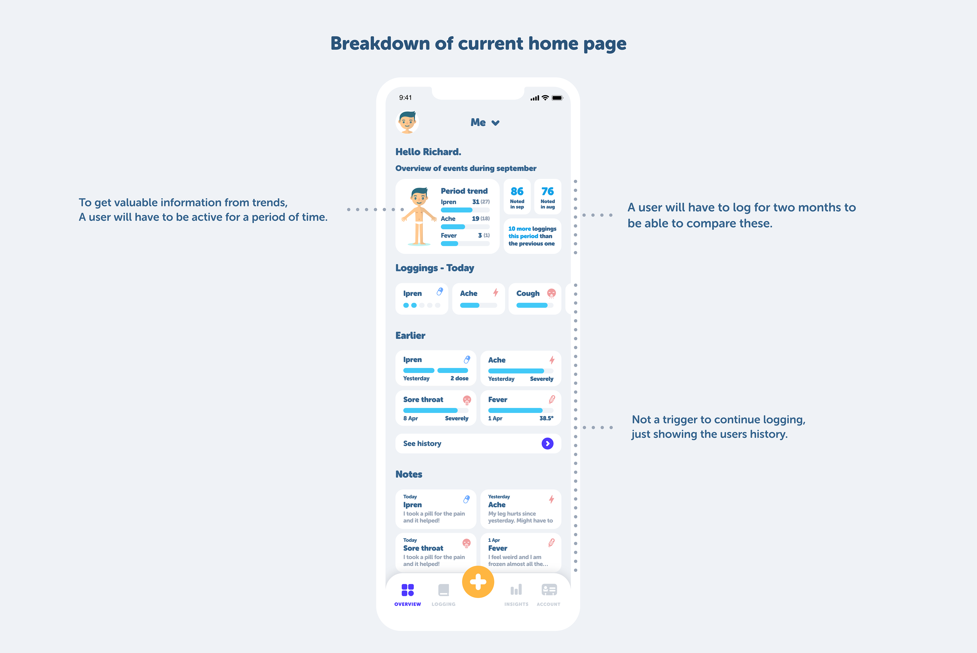
After analyzing our retention diagram on Google Analytics and our charts on Lookers Studio, we noticed that user retention did not meet our expectations.
To address this issue, we looked at Nona to track down the most significant pain points for new users.
To address this issue, we looked at Nona to track down the most significant pain points for new users.
We realized that:
- the current home page was focusing more on long-term users
- it was difficult for new users to understand the product’s value instantly
- we did not have any instant rewards or valuable feedback for new users
- it was difficult for new users to understand the product’s value instantly
- we did not have any instant rewards or valuable feedback for new users
Design process
Defining the MVP
After identifying the pain points, our team held a brainstorming workshop and concluded that we needed to focus on the following areas:
- Redesign the home page to make it more fun and rewarding
- Implement gamification
- Build a Nona community
- Improve our onboarding process to make it more helpful and simple
- Create a rewarding system based on a "x-day challenge" concept
- Implement gamification
- Build a Nona community
- Improve our onboarding process to make it more helpful and simple
- Create a rewarding system based on a "x-day challenge" concept
Throughout the entire design process, I worked closely with the developers to ensure an easily integrated solution.
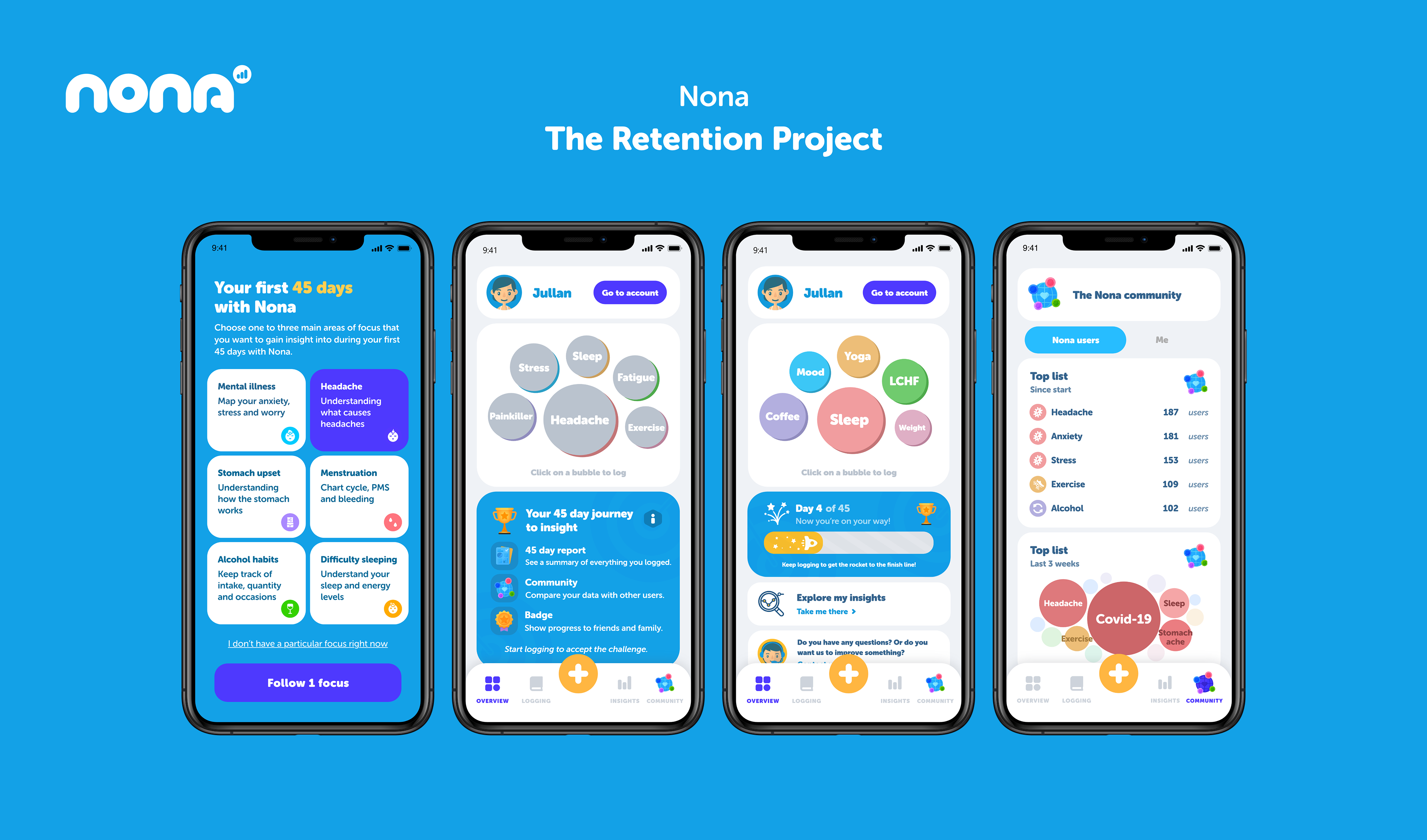
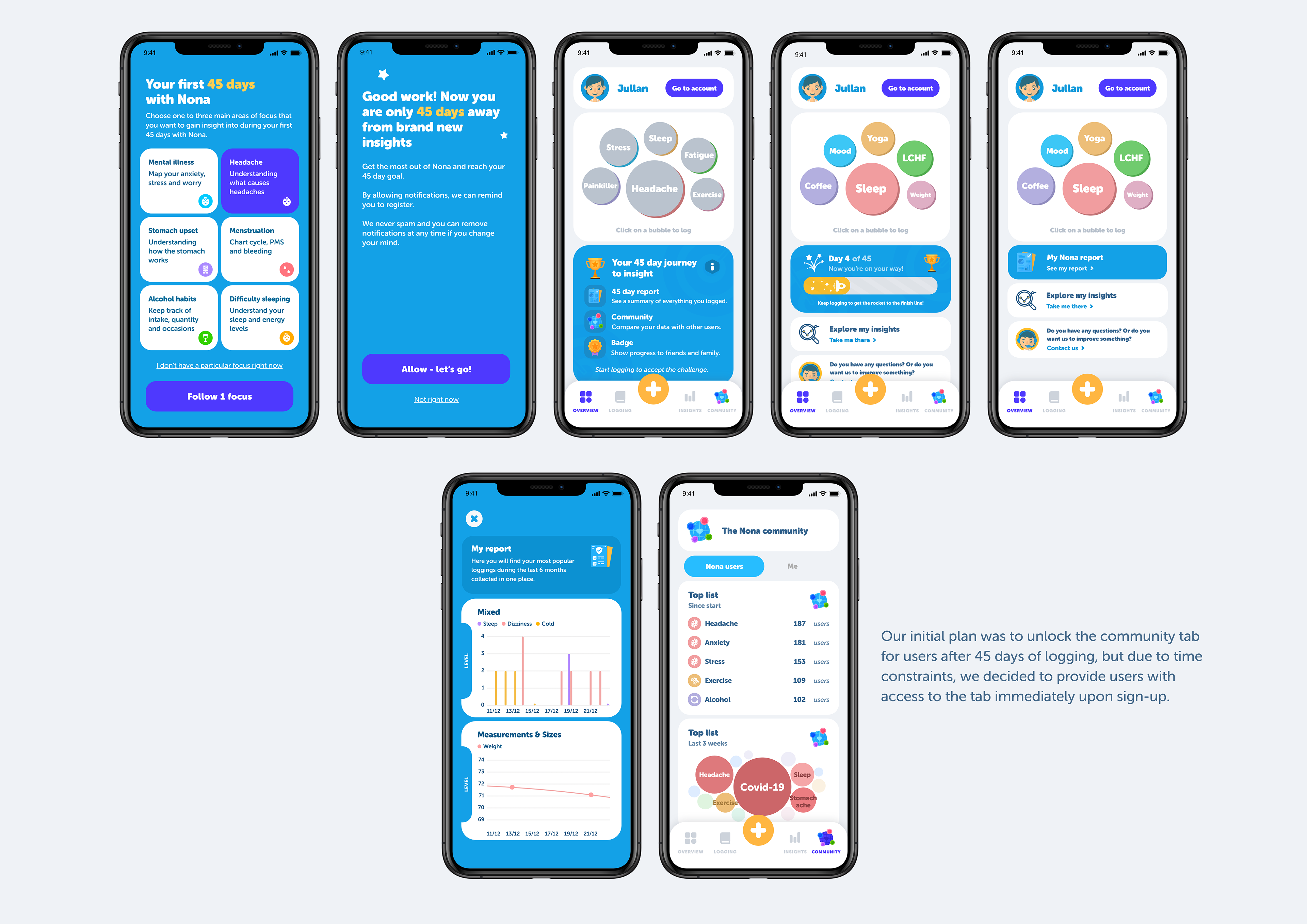
45-day challenge - Motivation to continue
One solution we developed to increase retention and motivate new users was a 45-day reward system. The concept is based on unlocking different features after 45 days of logging in Nona. These features include:
- A badge that is pinned to the user’s profile, which could be something fun to share with others.
- Access to insights in the Nona community, including the ability to see how others log, explore different trends and compare data with others.
- A customized report that includes charts generated from the user’s input data during the 45-day challenge.
- Access to insights in the Nona community, including the ability to see how others log, explore different trends and compare data with others.
- A customized report that includes charts generated from the user’s input data during the 45-day challenge.
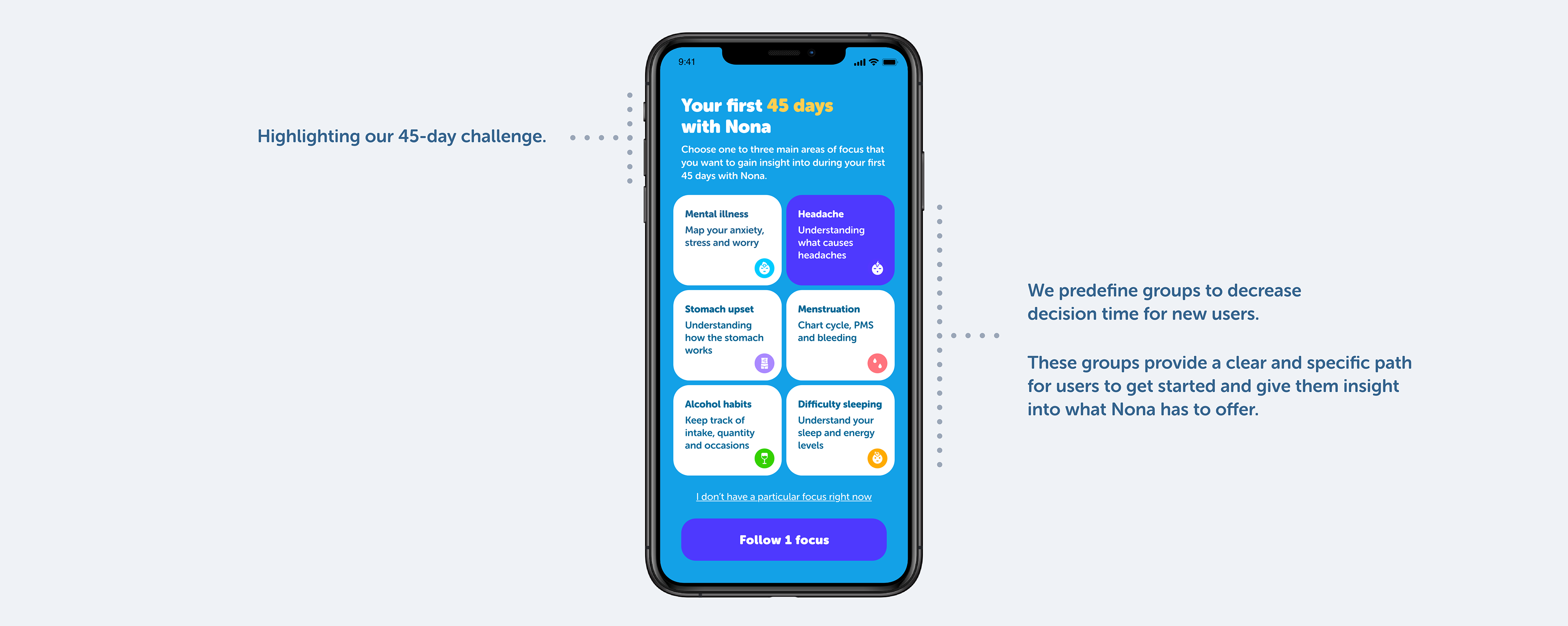
1. New Onboarding - Get users on track
The onboarding process is a crucial step in generating interest from first-time users and helping them get started. To improve this process, we made the following changes:
- Reduced the amount of decision-making required by the user during onboarding.
- Narrowed down the onboarding process to a clear and specific path.
- Educated users early on to enhance their understanding of Nona.
- Created a fast and easy start to help users get started quickly.
- Narrowed down the onboarding process to a clear and specific path.
- Educated users early on to enhance their understanding of Nona.
- Created a fast and easy start to help users get started quickly.
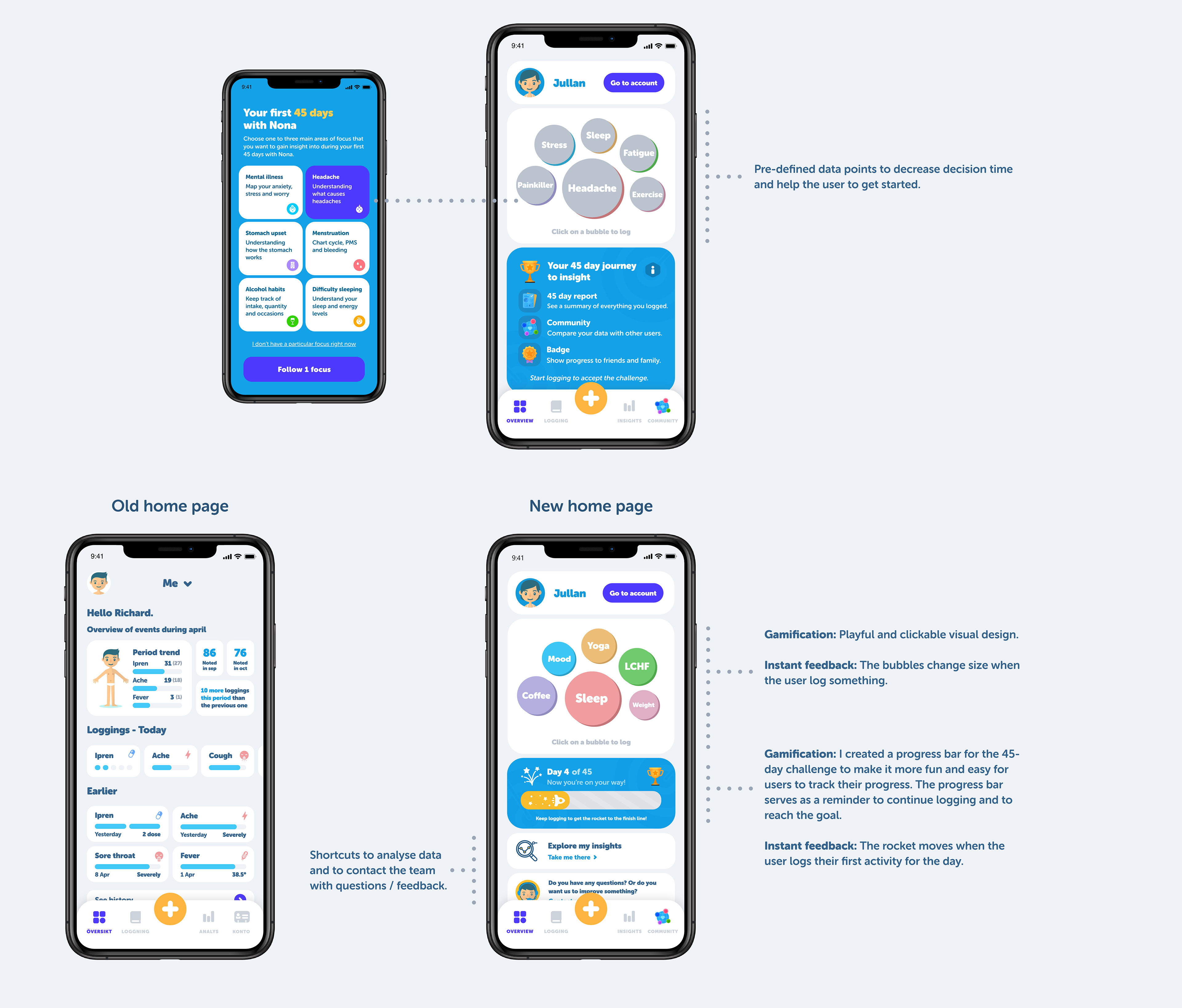
To simplify the user journey, I created a view in the onboarding process where users can choose up to three different main areas they want to follow in Nona.
We narrowed down a range of options to specific starting points. When deciding on our main areas of focus, we partially looked at Nona's user data charts.
We narrowed down a range of options to specific starting points. When deciding on our main areas of focus, we partially looked at Nona's user data charts.
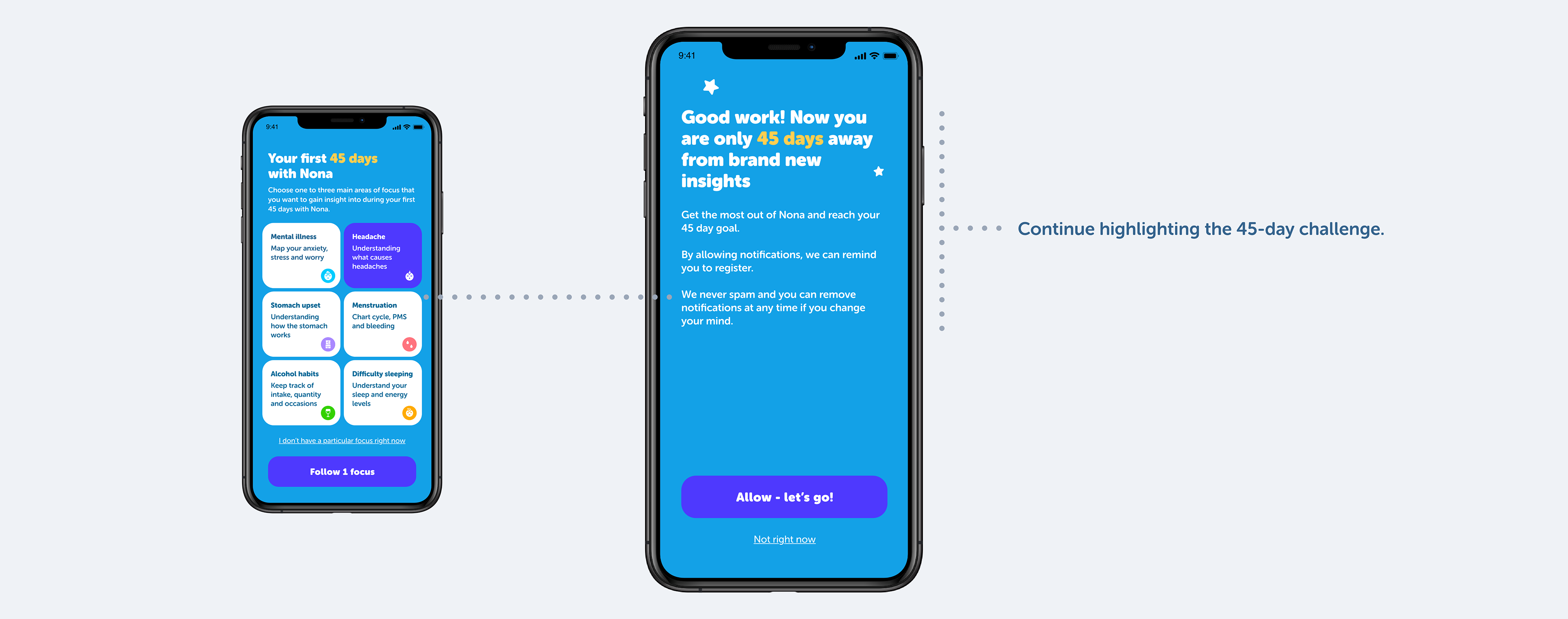
2. Push notifications - A way to help users remember
After the user chooses a main focus, we prompt them to the push notifications view, which provides context and explains why the user should accept the notifications.
3. Redesigning homepage - An easy and fun concept
When redesigning the home page I focused on:
- making it more fun and simple
- making it more suitable for new users
- instant feedback when logging
- making it more suitable for new users
- instant feedback when logging
Depending on which main area the user chooses in the first view, the bubbles on the home page are auto-filled with data connected to that area.
The 45-day challenge, user journey
Results
After the release of the redesigned app and the new features, we analyzed our retention chart and observed an immediate increase in retention.
If there was more time available:
- Continuously analyze the retention
- User research and identify the biggest pain points
- Find where people drop off and analyze why